The Setup
I was asking Google Gemini a handful of questions in the web UI. The topic doesn't matter here. One of the answers came back as a table, which is exactly the right format for the content: several rows, several columns, each cell a short phrase.
The table was slightly too wide for the reply column. Nothing was broken, exactly: a horizontal scrollbar appeared at the bottom of the table, and scrolling right revealed the hidden columns. But I wanted a screenshot of the entire table, and you can't screenshot something you have to scroll to see. My window was wide, with plenty of unused space on both sides of the reply. Gemini just wouldn't let the table use it.
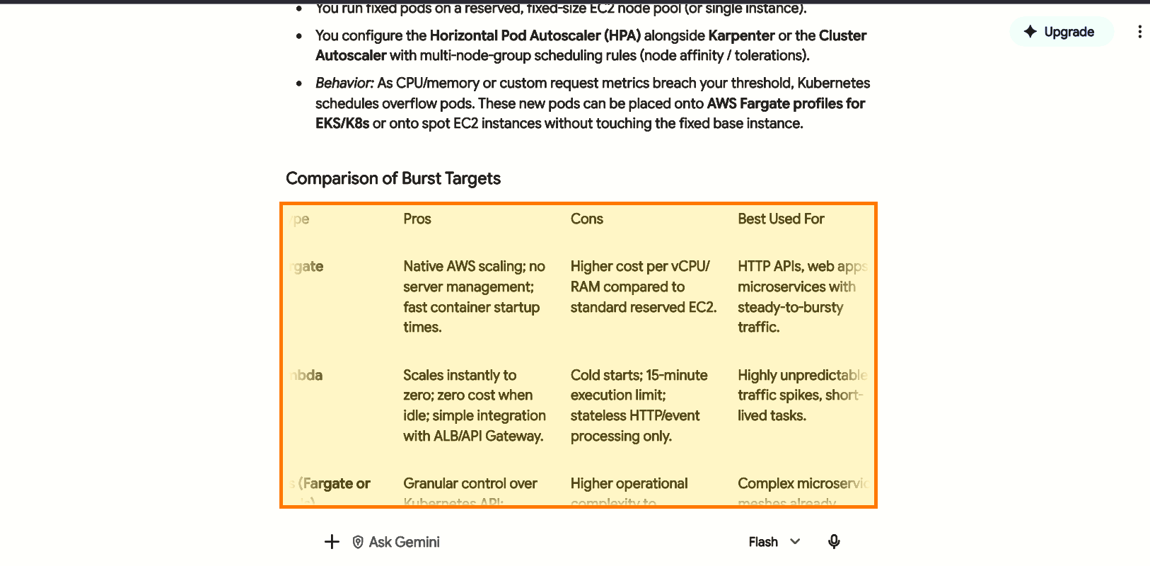
The table, highlighted, inside Gemini's default reply column. It's scrolled sideways: the first column ("Target Type") is cut off on the left, and the text fades out on the right. You never see all four columns at once.
What's Going On
Chat UIs put the conversation in a centered column with a max-width, usually somewhere between 700 and 800px. It's a sound default for prose, since long lines of text are hard to read. It's also why a chat that renders paragraphs beautifully can struggle the moment the model emits something inherently wide: a table, a long code line, a URL.
A table is different from a paragraph. Text wraps to fit its container. A table's columns have a minimum content width, so once there are enough columns the table is wider than its container, and the browser has to decide what to do with the overflow. Roughly, there are three outcomes:
Container's overflow |
What you see |
|---|---|
visible (default) |
The table spills out past the column. Ugly, but everything is readable |
auto / scroll |
A horizontal scrollbar appears; you can scroll to the hidden columns |
hidden |
The overflow is clipped. The columns are still in the DOM, but you can't reach them |
Gemini was in the middle row: the scrollbar tells me the table sits inside a container that scrolls sideways. That's a perfectly reasonable design. It just isn't what I needed at that moment.
There's one more detail, and it's the one that aggravated me most: the fade. Look at the left and right edges of the table in the first screenshot. The text doesn't stop at the edge of the column; it fades out, so the last few characters of every cell on either side are washed out and hard to read. I assume it's meant as a hint that there's more content off-screen, and as a hint it's fine. But it means the part of the table you can see isn't fully legible either, and a screenshot of a table that fades at both ends is useless for what I wanted. As far as I can tell, you can't switch it off.
What I can't tell you is which element carries the narrow limit. I opened DevTools and went looking for the property, and I never found it. The page is a deep pile of nested elements with generated class names, and a max-width can sit on any ancestor, or come from a grid or flex layout rather than a declaration I could spot.
Workarounds
Roughly in order of effort:
- Zoom out.
Ctrl+-shrinks everything. It only helps if the column's width isn't fixed in CSS pixels, because amax-widthin pixels scales down along with the table. Cheap to try. - Fix it in DevTools. Right-click the table, choose Inspect, walk up the tree until you find the ancestor with the
max-width, and untick it. Instant, but it disappears on reload, and it only works if you can find the right ancestor. I couldn't. - Export the table. Gemini has an export button on its tables. That's the right tool if you want the data, but it wasn't what I needed: I wanted a picture of the table as it was rendered in the conversation.
- Make the fix permanent with a user style. A browser extension that injects your own CSS into a site. This is what I ended up doing.
What Actually Worked: Asking Gemini to Fix Gemini
Having failed in DevTools, I did the slightly absurd thing and asked Gemini how to permanently widen its own response column. It suggested installing a Firefox extension called Custom CSS and applying these rules to the Gemini site:
main,
[role="main"],
article,
div[class*="content"],
div[class*="markdown"] {
  max-width: 92vw !important;
  width: 100% !important;
}

/* Neutralize narrow grid or flex layout restrictions */
main *,
[role="main"] * {
  max-width: 100% !important;
}
It worked on the first try: the reply column now takes up most of the window, the table fits, and I got my screenshot.
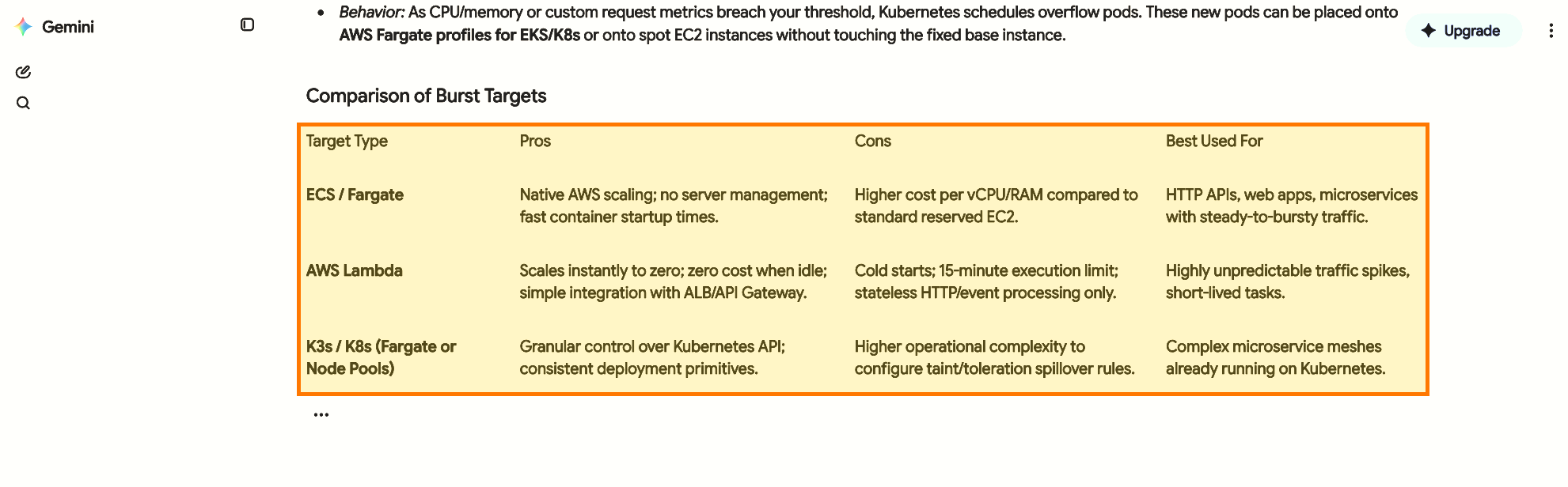
The same table after applying the CSS: all four columns visible at once.
It was a helpful enough answer that I gave it a thumbs up. The browser doesn't matter to the CSS itself, since Chrome and others would render the page the same way, but the extension I used is a Firefox add-on, so on another browser you'd need its equivalent.
Why it works, and why I'm a little uneasy about it
This is a shotgun, not a scalpel. It's what you write when you can't find the one rule responsible:
- The first block covers every plausible container.
main,[role="main"]andarticleare structural elements.div[class*="content"]anddiv[class*="markdown"]are attribute selectors that match anydivwhose class name merely contains those words. Gemini's real class names are generated and opaque, so this is guessing that some of them contain "content" or "markdown". It happens to hit. - The second block,
main * { max-width: 100% !important }, removes the cap from every descendant ofmain. That's the part that defeats layout constraints I couldn't locate: whichever nested element had the narrow limit, it now can't exceed its parent, and the parent is now 92% of the viewport. !importanton everything is how it wins against the site's own rules without knowing their specificity. It's also why it's brittle to debug.
The tradeoffs are real. It will break if Google restructures the page or renames the classes those substring matches depend on. The universal main * rule may affect things that were supposed to have their own widths, such as buttons, popovers and the input box, so it's worth a look at the whole page and not just the table. A table wider than 92% of the window would still get its scrollbar. And reading prose across a 92vw column is harder on the eyes, which is the reason the original column was narrow in the first place.
I'll take that trade, because the alternative was stitching several screenshots together. But if you go this route, a better long-term version is the one I couldn't write: find the real element and target it directly.
Would This Affect Code Blocks and CSV Too?
I only saw this with a rendered Markdown table, and that's all I tested. My guess is that any wide content inside the same column would run into the same limit, including a code block or CSV output, but I haven't verified that.